How to Illustrate a Garbage Pail Bud
There’s an easy way to make a cannabis character: draw a nug, slap some eyes on it, give it arms and legs, maybe stick a joint in its mouth, and call it done. The problem is that everybody has already done that about a thousand times. A Garbage Pail Bud should work differently. The strain itself should become the character. The name, appearance, effects, personality, pose, color palette, and visual joke should all feel like parts of the same idea instead of a bunch of separate things glued together.
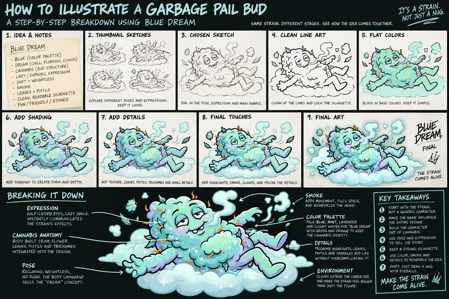
Blue Dream is probably the cleanest example. The lazy version would be a blue cannabis nug sleeping in a bed. Technically that explains the name, but it’s also painfully obvious. Instead, Blue Dream works because “blue,” “dream,” and “cannabis” are baked into the whole design. The body is made out of cannabis flower, the palette shifts into mint, turquoise, pale blue, lavender, and cloudy white, and the character is basically melting into a relaxed reclining pose. The half-closed eyes, lazy smile, drifting smoke, and cloud underneath it all say “dream” without needing a pillow, bed, alarm clock, moon, or a giant sign explaining the joke.
That’s the first real rule: start with the strain, not the character. Before drawing anything, ask what the strain name gives you visually. What does the name suggest? What does the flower look like? What does the strain supposedly feel like? What personality could come out of that? You’re not asking, “How do I draw a weed nug?” You’re asking, “If this strain somehow became alive, what the hell would it look like?” That one change in thinking makes the design way more specific.
The cannabis itself should also be structural. Don’t draw a normal person or monster and then decorate it with buds afterward. Build the anatomy out of flower. Large buds can become the head, chest, shoulders, hands, knees, cheeks, hair, or muscles. Leaves can become eyebrows, ears, clothing, feathers, claws, fins, or random accents. Orange pistils can act like hair, whiskers, veins, spikes, or eyebrows. Trichomes can become frost, highlights, sparkle, sweat, residue, crystals, or whatever else fits the concept. The goal is for the character to look like if you cut it open, there would just be more weed inside.
The pose matters just as much as the flower. Blue Dream works because the body language is doing half the storytelling. It’s reclined, loose, floating, and clearly in no rush to do anything productive ever again. A heavy strain should look like gravity is beating the shit out of it. An energetic strain should have limbs flying everywhere. An aggressive strain should lean forward and feel ready to attack. A space-themed strain may not even need to touch the ground. The pose should exaggerate what the strain represents before the viewer even gets to the face.
Then there’s the face, which is where the character actually becomes alive. Subtlety really isn’t the point here. If the strain is relaxing, make the character look ridiculously relaxed. If it’s anxious, make it look like it just remembered every embarrassing thing it has ever done. If it’s energetic, make the eyes look like they haven’t blinked since last Thursday. Blue Dream’s half-lidded eyes and dumb little grin work because you already know what that character sounds like without hearing a word. Probably something profound like, “Wait... what?”
I also avoid making everything perfectly symmetrical. One eye can be more closed than the other. One eyebrow can sit higher. A tooth can be crooked. One corner of the mouth can sag. Perfect mirror symmetry makes gross cartoon characters feel assembled. Small inconsistencies make them feel like actual characters. You want controlled ugliness, not a logo with a face.
Before getting buried in detail, the silhouette has to work. Cannabis is already visually noisy, so once you add limbs, facial features, smoke, props, leaves, pistils, and texture, things can turn into visual oatmeal very quickly. Shrink the artwork down and see if you can still understand the pose. You should be able to tell where the head is, what the body is doing, and where the main action is happening before noticing a single trichome. Details should improve a readable drawing, not rescue an unreadable one.
Color should be part of the concept too. Blue Dream obviously benefits from blue, mint, and lavender, but the same logic applies to anything else. Don’t automatically fall back on generic dark green because cannabis happens to be green. You’re making a cartoon interpretation, not a product photograph. Reality will survive. Keep enough cannabis coloration in there for the plant structure to read, but let the strain name drive the palette when it gives you something stronger to work with.
Trichomes are another place where it’s easy to go nuts for no reason. You don’t need to illustrate every microscopic resin gland. That’s how you end up making the character look diseased. Use grouped texture instead: small white dots, frosty edges, crystalline highlights, little sparkle shapes, and concentrated texture where the light would naturally hit. Blue Dream does this especially well because those little bright shapes read both as frosty cannabis and as dreamy sparkle. One element is doing two jobs, which is exactly what you want.
Smoke can do the same thing. It isn’t just something coming out of the character’s mouth. It can create movement, fill negative space, guide the eye, connect parts of the composition, and reinforce the mood. Blue Dream’s smoke is slow and soft because the whole character is slow and soft. On another strain the smoke could whip around aggressively, form shapes, explode outward, or turn into something else entirely.
Props are optional, and I think people lean on them way too much. If you need fifteen objects surrounding the character before the audience understands the joke, the core idea probably isn’t strong enough. Blue Dream barely needs anything besides clouds and smoke because the character itself is carrying the concept. Props should strengthen the joke, not testify in court on its behalf.
The same goes for backgrounds. Even when the background is minimal, it should feel like the strain is leaking out into the environment. Clouds, smoke, stars, ice, fruit, fire, syrup, webbing, crystals, whatever fits. The character should still be the first thing you see, followed by the face and the main joke. Everything else should reward you for looking longer instead of fighting for attention.
And finally, do the name test. Hide the strain name and look at the finished character. Does the illustration still communicate the idea? With Blue Dream, even without text, you still see cannabis, blue, cloud-like softness, dreamy body language, and somebody who looks so relaxed they may have forgotten what gravity is. That’s what you’re aiming for. If the character could be renamed almost anything and still work, the design probably isn’t specific enough yet.
A Garbage Pail Bud shouldn’t just be a weed mascot. It should feel like a cannabis strain somehow developed consciousness, crawled out of the jar, immediately acquired a personality problem, and became everybody else’s problem. Start with the strain name, turn the cannabis into the anatomy, make the pose and face sell the personality, use color and texture to reinforce the idea, and don’t stop at the first obvious joke unless you can push it into something better.
Most importantly, don’t just draw a nug with eyeballs. We already have enough of those.